Srit: Svelte Responsive Image Tags

Introduction
Svelte Responsive Image Tag (SRIT) is a Svelte component that simplifies the creation of responsive images by automatically selecting the appropriate format based on the browser's capabilities. The component uses the "picture" element to provide multiple image sources in different formats and the "img" element with the "srcset" and "sizes" attributes to choose the optimal source based on the device's screen size and resolution.
Installation
pnpm i -D sritGitHub repo
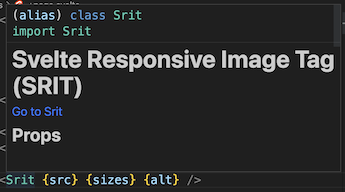
SritUsage
The above image is created by the following in a Svelte file:
<script lang="ts">
  import Srit from 'srit';
  const imageSrc = 'images/test-image.jpg';
  const imageSizes = [100, 200, 400, 800];
  const imageAlt = 'Test Image';
</script>

<Srit src={imageSrc} sizes={imageSizes} alt={imageAlt} />
The created HTML is the following:
<picture>
  <source
    type="image/avif"
    srcset="images/test-image-2-100.avif?width=100 100w,
    images/test-image-2-200.avif?width=200 200w,
    images/test-image-2-400.avif?width=400 400w,
    images/test-image-2-800.avif?width=800 800w">
  <source
    type="image/webp"
    srcset="images/test-image-2-100.webp?width=100 100w,
    images/test-image-2-200.webp?width=200 200w,
    images/test-image-2-400.webp?width=400 400w,
    images/test-image-2-800.webp?width=800 800w">
  <img
    src="images/test-image-2.jpg"
    srcset="images/test-image-2-100.jpg?width=100 100w,
    images/test-image-2-200.jpg?width=200 200w,
    images/test-image-2-400.jpg?width=400 400w,
    images/test-image-2-800.jpg?width=800 800w"
    sizes="(max-width: 800px) 100vw, 50vw"
    loading="lazy"
    decoding="async"
    alt="Test Image">
</picture>
Props
The following props are available for the Srit component:
| Name | Description | Default |
|---|---|---|
| src | A required prop that specifies the URL of the image to display. | |
| avif | An optional prop that specifies whether to include an avif source in the picture element. | true |
| webp | An optional prop that specifies whether to include a webp source in the picture element. | true |
| sizes | An optional prop that specifies an array of image sizes to include in the srcset attribute of the img element. | [100, 200, 400, 800] |
| alt | An optional prop that specifies the alternative text for the image. | |
| loading | A string indicating whether the image should be lazily loaded. Can be "lazy", "eager", null, or undefined. | lazy |
| decoding | A string indicating the decoding mode for the image. Can be "async", "auto", "sync", null, or undefined. | async |
Component document
If you are using an LSP-compatible editor, such as VSCode, Atom, Sublime Text, or Neovim, hovering over a component name will display a documentation link, features, props, events, and an example.
Bimgc to create all your images from one image
You can convert your image to all AVIF and WEBP images by using bimgc.
Installing bimgc
npm i -g bimgc
bimgc --version
bimgc --help
bimgc configuration file
Create a configuration file, bimgc.config.cjs in the project root directory:
module.exports = {
  inputDir: "static/images",
  outputDir: "static/images",
  sizes: [100, 200, 400, 800],
  formats: ['avif', 'webp'],
  imageFiles: ['example-1.jpg', 'example-2.png']
};
Add the following to the scripts section of your package.json file:
"scripts": {
  "gen:images": "bimgc -c bimgc.config.cjs"
}
To generate the images, run the following command:
npm run gen:imagesFind more information about bimgc.